
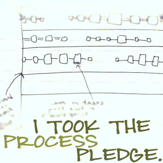
I needed that page!
Turns out I am terrible at seeing colour in my head and matching it to fabrics in the real world, but this simple colour wheel exercise was illuminating. I had no trouble with blue, red and yellow, the primary colours. My sense of what they were and which fabrics represented them best was quite accurate. But things began to fall apart when it came to green, purple and orange. Turns out I did not have a clear idea of what those base colours really are. I saw a range of colours as being equivalent, which of course they were not. But with the book's colour wheel at hand, I could match basic green to the basic green fabrics in my stash, putting to one side the yellow greens, and the blue-greens, which suddenly I could see were quite different after all.
Things got even harder with purple. I had one in my stash that approximated the purple on the colour wheel. All the others were actually from the much pinker looking red-violet range (the same range from which most of my favourite pinks are drawn, although some pinks fall squarely into the red family rather than red-violet. I don't tend to like red based pinks very much.).
Orange was nearly my downfall. Again, I had only one true orange fabric in my stash. The other "oranges" I had were all yellow-oranges. I had not thought of them as different until I actually compared them to the colour wheel.
The most difficult colour of all turned out to be red-orange. I had absolutely no awareness of this as a hue all on its own. Couldn't even conjure up a mental image of "red-orange". But again, I compared the red-orange on the colour wheel to my stash...and found ONE fabric that fit the bill. And I was surprised to find I really, really liked that colour. How odd I didn't have more of it!
Here is my finished colour wheel from Exercise 1. Yours would look different, depending on what fabrics you have in your stash. And Maria advises making up additional fabric colour wheels in variations: all prints, or all solids, or all polka dots. More practice will refine your eye and build your familiarity with your stash:

At the end of the exercise, Maria asks "What hues did you have trouble identifying in the colour wheel?"
For me, the hardest were blue-violet (again, I only had one and had always thought of it as a blue), and red-orange, which I had never thought about at all. This led me to ask myself "What hues should I be looking for to round out my stash and build my sense of colour?" I resolved to add:
1. Red-oranges and blue-violets...although I will have to take along the colour wheel at first to keep me "on colour"!
2. Colours I had few examples of. My stash turned out to be mostly blues, greens, and violet-red pinks. Period.When I go stash shopping, I will actively collect blue-greens, purples, oranges, orange-reds, yellows.

Red-violet.

The elusive red-orange!
Exercise #2 will focus on value...can't wait!


0 comments:
Post a Comment