There is a shift going on in the quilting fabric world, as quiltmakers who themselves are not hand dyeing or printing fabric are searching for that surface design look, a look I blogged about earlier in a post featuring the work of independent fabric designer Marcia Derse.
Fabric houses are reacting, and much more quickly than they have in the past, to new avenues in fabric design. On a recent fabric browse I picked up a charm pack of the new Moda collection "simple marks" by Malka Dubrawsky.
I am a big fan of bright, saturated tuquoise, and that is one of the signature colours of this fresh, earth tone oriented collection:
Especially useful are the "cheater cloth" designs, good for quick projects, and particularly handy if you just want to do a quick sandwich on which to practice your free motion skills:
Like Marcia's abstracts, these fabrics make a good addition to the modern quilt/art quilt stash.
I would also like to send you all over to my friend Susan's new blog, Sew Susan Sew! I met Portland Oregon's Susan Albright at the 2011 Sisters, Oregon Outdoor Quilt Show, and have shamelessly invited myself back to her home several times! Susan's quilting is beautifully informed, colour-full and as she is a prolific artist, I have had the pleasure of watching her design process over the course of several projects. Take a good look at the round robin blog postings...that round robin was my first and I was amazed at how it pushed me to really think about design, and to work creatively within what I first found to be an uncomfortably limited framework. To my surprise, it was that framework that pushed me to new design learnings; the tight structure of dealing with a work already begun, and hewing to its creative identity forced me to narrow my design focus and really concentrate on how to pull together elements that worked. It was a watershed experience, one I highly recommend.
Here, from the same round robin, is another work:

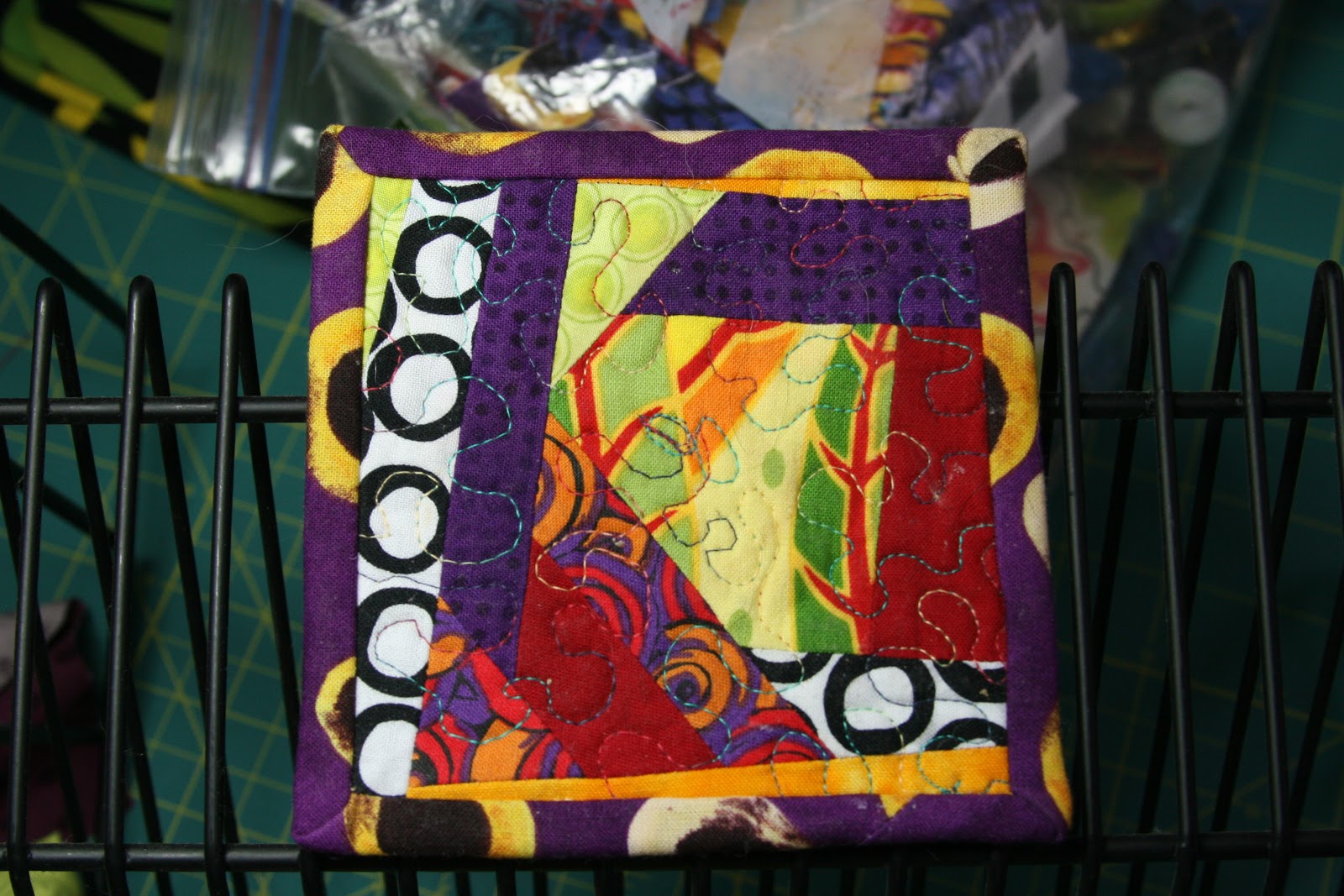
I received this piece as the third in a line of three round robin quilters. The only terms of our RR agreement were to add on between 2" and 10" per round, and to send on to the next quilter at least two of the fabrics already used in the piece. I had a personal resolve to only have each RR installment in my workroom for one month. In that time I had to figure out what to do, do it, and mail the package off to the next quilter in line.
When I opened this parcel, I was dismayed. The muted tones are not colours I was comfortable working in, and as in most round robin projects, I was unhappy with the ever expanding square within a square progression. Because you are adding on, it is very hard not to just keep adding border after border. The second quilter had made a concerted effort to bring movement and diagonal elements into the work, honouring the creative piecing in the centre. But I had a big ol' cerise square frame pushing for attention.
I debated....would I add on just to the top and bottom, to force a rectangular finished shape? How would I manage the grey sky fabric...could I make it an homage to our dark and rainy, soggy Pacific Northwest winters? How was I going to deal with that cerise border? It was usurping centre stage as the piece's design focus, and I was pretty sure the original intention was to highlight the beauty and whimsy of butterflies, along with the idea of windows onto other landscapes. And I wanted to avoid making the piece too "matchy" or twee.
I parked the piece on a design wall and gave myself permission to think about it for a few days. Meanwhile, I treated myself to a new book: Quilting Modern, by Jacquie Gering and Katie Pedersen. I was idly leafing through the pages when with a shock I realized their Supernova Quilt (p. 104) was similar in many ways to the RR I was struggling with:
Here was a novel approach...a border pieced together in such a way as to be based on a square grid, but suggesting diagonal, broken lines. Aha! And the free form shapes on the outer edges suggested butterflies. Double Aha! Here too, the designer had dealt with a strong centre element (also cerise) by using the element again (as the cerise in the outer ring). Which is one great lesson...if something in a block is taking over the visuals, you can quiet it down by repeating its elements elsewhere in the quilt. This gives you an avenue to also add balance while you strive to unify the "voice" in the quilt.
I decided to frame the piece I had with the "not frame" technique used in the supernova quilt. I tried to pick up the cerise, but that created a big problem...the dark purple elements in the butterflies and two of the tilted butterfly frames were then left as the boldest of the quilt voices and became the focal point. And they did not work well as the focal point. I switched over to electric purple fabrics, ones with lighter hits of pink and cerise in them, and tried again. It worked.
To finish off, I auditioned many, many solid or reads as solid fabrics for the final background. I thought the yellow green would be the logical go-to fabric, but it looked underwhelming, drab. Ditto the orange and then salmon fabrics I tried. I pulled out half my stash looking for the right fabric...and realized I had already used it. The winning fabric turned out to be the reverse side of one of my purple border fabrics. I was lucky that yardage was still available locally. I pieced a second round of wonky border, and then finished quickly by composing the background out of a grid of squares, piecing on corner bits that finally ended up coming together as free form butterflies that echoed the bright colours in the central piecing.
I felt brilliant! By staying tightly focused on the original elements, listening to what they were saying, I was able to figure out a path that both amplified and enhanced what I had been sent. I liked it a lot, and I hope you do too!
Fabric houses are reacting, and much more quickly than they have in the past, to new avenues in fabric design. On a recent fabric browse I picked up a charm pack of the new Moda collection "simple marks" by Malka Dubrawsky.
I am a big fan of bright, saturated tuquoise, and that is one of the signature colours of this fresh, earth tone oriented collection:
 | |||||
| sample of "simple marks" by Malka Dubrawsky for Moda |
 | ||
| Cheater cloth, summer tones |
I would also like to send you all over to my friend Susan's new blog, Sew Susan Sew! I met Portland Oregon's Susan Albright at the 2011 Sisters, Oregon Outdoor Quilt Show, and have shamelessly invited myself back to her home several times! Susan's quilting is beautifully informed, colour-full and as she is a prolific artist, I have had the pleasure of watching her design process over the course of several projects. Take a good look at the round robin blog postings...that round robin was my first and I was amazed at how it pushed me to really think about design, and to work creatively within what I first found to be an uncomfortably limited framework. To my surprise, it was that framework that pushed me to new design learnings; the tight structure of dealing with a work already begun, and hewing to its creative identity forced me to narrow my design focus and really concentrate on how to pull together elements that worked. It was a watershed experience, one I highly recommend.
Here, from the same round robin, is another work:

I received this piece as the third in a line of three round robin quilters. The only terms of our RR agreement were to add on between 2" and 10" per round, and to send on to the next quilter at least two of the fabrics already used in the piece. I had a personal resolve to only have each RR installment in my workroom for one month. In that time I had to figure out what to do, do it, and mail the package off to the next quilter in line.
When I opened this parcel, I was dismayed. The muted tones are not colours I was comfortable working in, and as in most round robin projects, I was unhappy with the ever expanding square within a square progression. Because you are adding on, it is very hard not to just keep adding border after border. The second quilter had made a concerted effort to bring movement and diagonal elements into the work, honouring the creative piecing in the centre. But I had a big ol' cerise square frame pushing for attention.
I debated....would I add on just to the top and bottom, to force a rectangular finished shape? How would I manage the grey sky fabric...could I make it an homage to our dark and rainy, soggy Pacific Northwest winters? How was I going to deal with that cerise border? It was usurping centre stage as the piece's design focus, and I was pretty sure the original intention was to highlight the beauty and whimsy of butterflies, along with the idea of windows onto other landscapes. And I wanted to avoid making the piece too "matchy" or twee.
I parked the piece on a design wall and gave myself permission to think about it for a few days. Meanwhile, I treated myself to a new book: Quilting Modern, by Jacquie Gering and Katie Pedersen. I was idly leafing through the pages when with a shock I realized their Supernova Quilt (p. 104) was similar in many ways to the RR I was struggling with:
 | ||
| Supernova quilt from "Quilting Modern" by Pedersen and Gering |
Here was a novel approach...a border pieced together in such a way as to be based on a square grid, but suggesting diagonal, broken lines. Aha! And the free form shapes on the outer edges suggested butterflies. Double Aha! Here too, the designer had dealt with a strong centre element (also cerise) by using the element again (as the cerise in the outer ring). Which is one great lesson...if something in a block is taking over the visuals, you can quiet it down by repeating its elements elsewhere in the quilt. This gives you an avenue to also add balance while you strive to unify the "voice" in the quilt.
I decided to frame the piece I had with the "not frame" technique used in the supernova quilt. I tried to pick up the cerise, but that created a big problem...the dark purple elements in the butterflies and two of the tilted butterfly frames were then left as the boldest of the quilt voices and became the focal point. And they did not work well as the focal point. I switched over to electric purple fabrics, ones with lighter hits of pink and cerise in them, and tried again. It worked.
 | ||||||||
| I add my first round, a wonky border based on a grid of squares! |
I felt brilliant! By staying tightly focused on the original elements, listening to what they were saying, I was able to figure out a path that both amplified and enhanced what I had been sent. I liked it a lot, and I hope you do too!
 |
| Finished Round Robin top for Hirome! |